
\(\newcommand{\bmu}{\boldsymbol{\mu}}\) \(\newcommand{\bSigma}{\boldsymbol{\Sigma}}\) \(\newcommand{\bfbeta}{\boldsymbol{\beta}}\) \(\newcommand{\bflambda}{\boldsymbol{\lambda}}\) \(\newcommand{\bgamma}{\boldsymbol{\gamma}}\) \(\newcommand{\bsigma}{{\boldsymbol{\sigma}}}\) \(\newcommand{\bpi}{\boldsymbol{\pi}}\) \(\newcommand{\btheta}{{\boldsymbol{\theta}}}\) \(\newcommand{\bphi}{\boldsymbol{\phi}}\) \(\newcommand{\balpha}{\boldsymbol{\alpha}}\) \(\newcommand{\blambda}{\boldsymbol{\lambda}}\) \(\renewcommand{\P}{\mathbb{P}}\) \(\newcommand{\E}{\mathbb{E}}\) \(\newcommand{\indep}{\perp\!\!\!\perp} \newcommand{\bx}{\mathbf{x}}\) \(\newcommand{\bp}{\mathbf{p}}\) \(\renewcommand{\bx}{\mathbf{x}}\) \(\newcommand{\bX}{\mathbf{X}}\) \(\newcommand{\by}{\mathbf{y}}\) \(\newcommand{\bY}{\mathbf{Y}}\) \(\newcommand{\bz}{\mathbf{z}}\) \(\newcommand{\bZ}{\mathbf{Z}}\) \(\newcommand{\bw}{\mathbf{w}}\) \(\newcommand{\bW}{\mathbf{W}}\) \(\newcommand{\bv}{\mathbf{v}}\) \(\newcommand{\bV}{\mathbf{V}}\) \(\newcommand{\bfg}{\mathbf{g}}\) \(\newcommand{\bfh}{\mathbf{h}}\) \(\newcommand{\horz}{\rule[.5ex]{2.5ex}{0.5pt}}\) \(\renewcommand{\S}{\mathcal{S}}\) \(\newcommand{\X}{\mathcal{X}}\) \(\newcommand{\var}{\mathrm{Var}}\) \(\newcommand{\pa}{\mathrm{pa}}\) \(\newcommand{\Z}{\mathcal{Z}}\) \(\newcommand{\bh}{\mathbf{h}}\) \(\newcommand{\bb}{\mathbf{b}}\) \(\newcommand{\bc}{\mathbf{c}}\) \(\newcommand{\cE}{\mathcal{E}}\) \(\newcommand{\cP}{\mathcal{P}}\) \(\newcommand{\bbeta}{\boldsymbol{\beta}}\) \(\newcommand{\bLambda}{\boldsymbol{\Lambda}}\) \(\newcommand{\cov}{\mathrm{Cov}}\) \(\newcommand{\bfk}{\mathbf{k}}\) \(\newcommand{\idx}[1]{}\) \(\newcommand{\xdi}{}\)
2.5. Application: regression analysis#
We return to our motivating example, the regression problem, and apply the least squares approach.
2.5.1. Linear regression#
Linear regression \(\idx{linear regression}\xdi\) We seek an affine function to fit input data points \(\{(\mathbf{x}_i, y_i)\}_{i=1}^n\), where \(\mathbf{x}_i = (x_{i,1}, \ldots, x_{i,d}) \in \mathbb{R}^d\) and \(y_i \in \mathbb{R}\) for all \(i\). The common approach involves finding coefficients \(\beta_j\)’s that minimize the criterion
This is indeed a linear least squares problem.
In matrix form, let
Then the problem is
We assume that the columns of \(A\) are linearly independent, which is often the case with real data (unless there is an algebraic relationship between some columns). The normal equations are then
Let \(\boldsymbol{\hat\beta} = (\hat{\beta}_0,\ldots,\hat{\beta}_d)\) be the unique solution of the system. It gives the vector of coefficients in our fitted model. We refer to
as the fitted values and to
as the residuals\(\idx{residuals}\xdi\). In vector form, we obtain \(\hat{\mathbf{y}} = (\hat{y}_1,\ldots,\hat{y}_n)\) and \(\mathbf{r} = (r_1,\ldots,r_n)\) as
The residual sum of squares (RSS)\(\idx{residual sum of squares}\xdi\) is given by
or, in vector form,
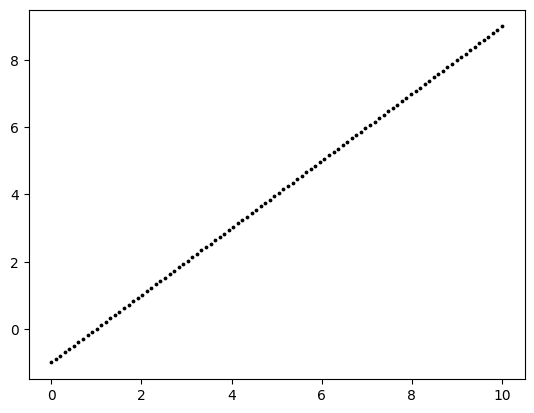
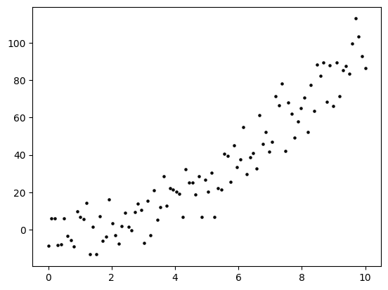
NUMERICAL CORNER: We test our least-squares method on simulated data. This has the advantage that we know the truth.
Suppose the truth is a linear function of one variable.
n, b0, b1 = 100, -1, 1
x = np.linspace(0,10,num=n)
y = b0 + b1*x

plt.scatter(x, y, s=3, c='k')
plt.show()
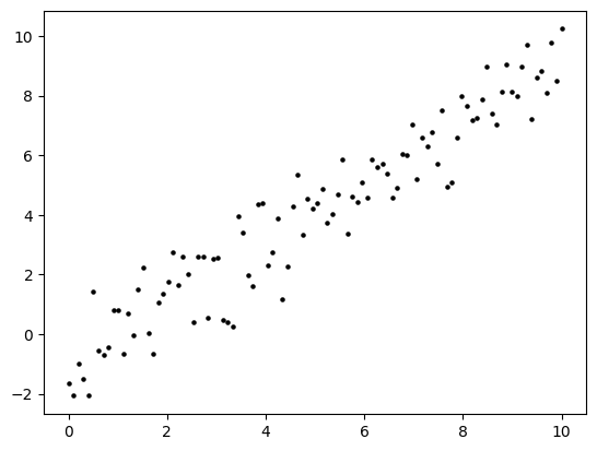
A perfect straight line is little too easy. So let’s add some noise. That is, to each \(y_i\) we add an independent random variable \(\varepsilon_i\) with a standard Normal distribution (mean \(0\), variance \(1\)).
seed = 535
rng = np.random.default_rng(seed)

y += rng.normal(0,1,n)

plt.scatter(x, y, s=5, c='k')
plt.show()
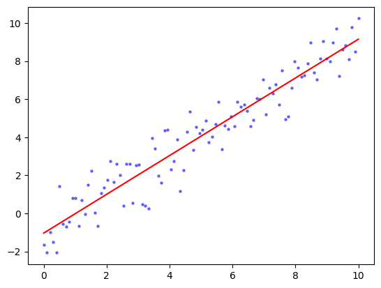
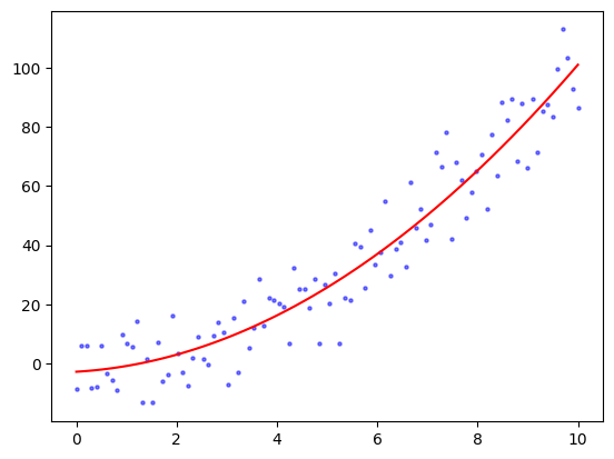
We form the matrix \(A\) and use our least-squares code to solve for \(\boldsymbol{\hat\beta}\). The function ls_by_qr, which we implemented previously, is in mmids.py, which is available on the GitHub of the book.
A = np.stack((np.ones(n),x),axis=-1)
coeff = mmids.ls_by_qr(A,y)
print(coeff)
[-1.03381171 1.01808039]
plt.scatter(x, y, s=5, c='b', alpha=0.5)
plt.plot(x, coeff[0]+coeff[1]*x, 'r')
plt.show()
\(\unlhd\)
2.5.2. Polynomial regression (and overfitting)#
Beyond linearity \(\idx{polynomial regression}\xdi\) The linear assumption is not as restrictive as it may first appear. The same approach can be extended straightforwardly to fit polynomials or more complicated combination of functions. For instance, suppose \(d=1\). To fit a second degree polynomial to the data \(\{(x_i, y_i)\}_{i=1}^n\), we add a column to the \(A\) matrix with the squares of the \(x_i\)’s. That is, we let
Then, we are indeed fitting a degree-two polynomial as follows
The solution otherwise remains the same.
This idea of adding columns can also be used to model interactions between predictors. Suppose \(d=2\). Then we can consider the following \(A\) matrix, where the last column combines both predictors into their product,
NUMERICAL CORNER: Suppose the truth is in fact a degree-two polynomial of one variable with Gaussian noise.
n, b0, b1, b2 = 100, 0, 0, 1
x = np.linspace(0,10,num=n)
y = b0 + b1 * x + b2 * x**2 + 10*rng.normal(0,1,n)

plt.scatter(x, y, s=5, c='k')
plt.show()
We form the matrix \(A\) and use our least-squares code to solve for \(\boldsymbol{\hat\beta}\).
A = np.stack((np.ones(n), x, x**2), axis=-1)
coeff = mmids.ls_by_qr(A,y)
print(coeff)
[-2.76266982 1.01627798 0.93554204]
Show code cell source
plt.scatter(x, y, s=5, c='b', alpha=0.5)
plt.plot(x, coeff[0] + coeff[1] * x + coeff[2] * x**2, 'r')
plt.show()
\(\unlhd\)
Overfitting in polynomial regression In adding more parameters, one must worry about overfitting\(\idx{overfitting}\xdi\). To quote Wikipedia:
In statistics, overfitting is “the production of an analysis that corresponds too closely or exactly to a particular set of data, and may therefore fail to fit additional data or predict future observations reliably”.[1] An overfitted model is a statistical model that contains more parameters than can be justified by the data.[2] The essence of overfitting is to have unknowingly extracted some of the residual variation (i.e. the noise) as if that variation represented underlying model structure.[3]
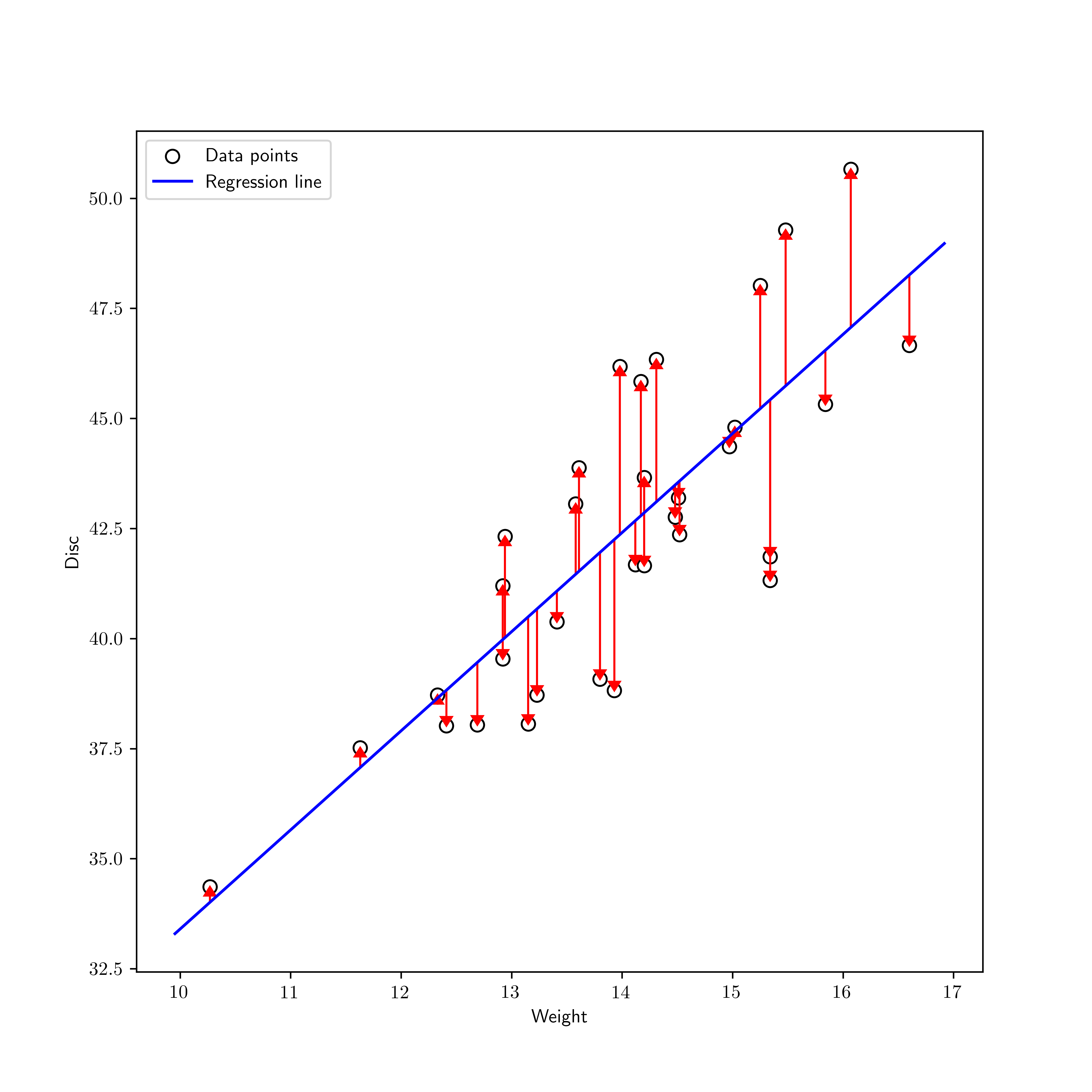
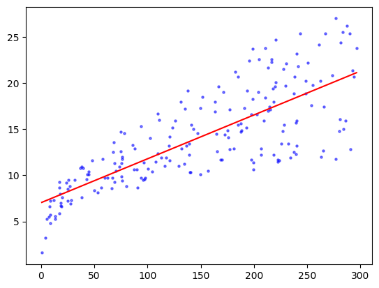
NUMERICAL CORNER: We return to the Advertising dataset from the [ISLP] textbook. We load the dataset again.
Figure: Pie chart (Credit: Made with Midjourney)

\(\bowtie\)
data = pd.read_csv('advertising.csv')
We will focus for now on the TV budget. We form the matrix \(A\) and use our least-squares code to solve for \(\boldsymbol{\beta}\).
TV = data['TV'].to_numpy()
sales = data['sales'].to_numpy()
n = np.size(TV)
A = np.stack((np.ones(n),TV),axis=-1)
coeff = mmids.ls_by_qr(A,sales)
print(coeff)
[7.03259355 0.04753664]
Show code cell source
TVgrid = np.linspace(TV.min(), TV.max(), num=100)
plt.scatter(TV, sales, s=5, c='b', alpha=0.5)
plt.plot(TVgrid, coeff[0]+coeff[1]*TVgrid, 'r')
plt.show()
A degree-two polynomial might be a better fit.
A = np.stack((np.ones(n), TV, TV**2), axis=-1)
coeff = mmids.ls_by_qr(A,sales)
print(coeff)
[ 6.11412013e+00 6.72659270e-02 -6.84693373e-05]
Show code cell source
plt.scatter(TV, sales, s=5, c='b', alpha=0.5)
plt.plot(TVgrid, coeff[0] + coeff[1] * TVgrid + coeff[2] * TVgrid**2, 'r')
plt.show()
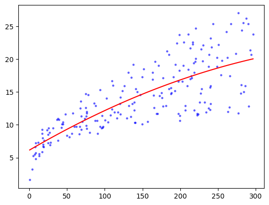
The fit looks slightly better than the linear one. This is not entirely surprising though given that the linear model is a subset of the quadratic one. But, as we mentioned earlier, when adding more parameters we must now worry about overfitting the data. To illustrate, let’s see what happens with a degree-\(20\) polynomial fit.
deg = 20
A = np.stack([TV**i for i in range(deg+1)], axis=-1)
coeff = mmids.ls_by_qr(A,sales)
print(coeff)
[ 1.06538698e+00  6.72896471e-01 -1.53138969e-02 -2.74088516e-04
  1.83651714e-05 -3.40080020e-07  3.17915742e-09 -1.64042005e-11
  4.43633296e-14 -4.25654490e-17 -5.28727398e-20  1.11822932e-22
 -3.47096893e-27 -2.44665112e-30 -2.79435976e-33 -4.05263859e-36
 -6.83137511e-39 -1.27993830e-41 -2.59569760e-44 -5.59960687e-47
 -1.26949578e-49]
saleshat = np.sum([coeff[i] * TVgrid**i for i in range(deg+1)], axis=0)

plt.scatter(TV, sales, s=5, c='b', alpha=0.5)
plt.plot(TVgrid, saleshat, 'r')
plt.show()
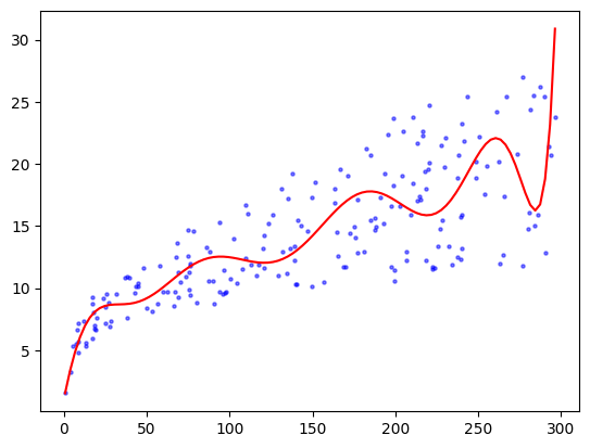
The outcome now seems to vary wildly, seemingly driven by the randomness of the data.
CHAT & LEARN: Ask your favorite AI chatbot about using cross-validation to choose a suitable degree. Ask for code and apply it to this dataset. (Open In Colab) \(\ddagger\)
\(\unlhd\)
Self-assessment quiz (with help from Claude, Gemini, and ChatGPT)
1 In linear regression, the goal is to find coefficients \(\beta_j\)’s that minimize which of the following criteria?
a) \(\sum_{i=1}^n (y_i - \beta_0 - \sum_{j=1}^d \beta_j x_{ij})\)
b) \(\sum_{i=1}^n (y_i - \beta_0 - \sum_{j=1}^d \beta_j x_{ij})^2\)
c) \(\sum_{i=1}^n (y_i - \{\beta_0 + \sum_{j=1}^d \beta_j x_{ij}\}^2)\)
d) \(\sum_{i=1}^n |y_i - \beta_0 - \sum_{j=1}^d \beta_j x_{ij}|\)
2 The normal equations for linear regression are:
a) \(A^T A \boldsymbol{\beta} = A^T \mathbf{y}\)
b) \(A A^T \boldsymbol{\beta} = A \mathbf{y}\)
c) \(A^T A \boldsymbol{\beta} = A \mathbf{y}\)
d) \(A A^T \boldsymbol{\beta} = A^T \mathbf{y}\)
3 In the numerical example with a degree-20 polynomial fit, the fitted curve:
a) Fits the data perfectly.
b) Fails to capture the overall trend in the data.
c) Captures the noise in the data as if it were the underlying structure.
d) Is a straight line.
4 What is the primary advantage of using simulated data to test the least squares method?
a) Simulated data eliminates the need for real-world data.
b) Simulated data provides a perfect fit without noise.
c) Simulated data allows us to know the ground truth.
d) Simulated data reduces computational complexity.
5 Which of the following best describes overfitting?
a) The model fits the training data well but generalizes poorly to new data.
b) The model fits both the training data and new data well.
c) The model fits the training data poorly but generalizes well to new data.
d) The model ignores random noise in the training data.
Answer for 1: b. Justification: The text states that in linear regression, we seek to find coefficients \(\beta_j\)’s that minimize the criterion \(\sum_{i=1}^n (y_i - \beta_0 - \sum_{j=1}^d \beta_j x_{ij})^2\).
Answer for 2: a. Justification: The text states, “The normal equations are then \(A^T A \boldsymbol{\beta} = A^T \mathbf{y}\).”
Answer for 3: c. Justification: The text states that “The essence of overfitting is to have unknowingly extracted some of the residual variation (i.e., the noise) as if that variation represented underlying model structure.”
Answer for 4: c. Justification: The text notes, “This has the advantage that we know the truth.”
Answer for 5: a. Justification: The text quotes Wikipedia: “An overfitted model is a statistical model that contains more parameters than can be justified by the data.”