
\(\newcommand{\bmu}{\boldsymbol{\mu}}\) \(\newcommand{\bSigma}{\boldsymbol{\Sigma}}\) \(\newcommand{\bfbeta}{\boldsymbol{\beta}}\) \(\newcommand{\bflambda}{\boldsymbol{\lambda}}\) \(\newcommand{\bgamma}{\boldsymbol{\gamma}}\) \(\newcommand{\bsigma}{{\boldsymbol{\sigma}}}\) \(\newcommand{\bpi}{\boldsymbol{\pi}}\) \(\newcommand{\btheta}{{\boldsymbol{\theta}}}\) \(\newcommand{\bphi}{\boldsymbol{\phi}}\) \(\newcommand{\balpha}{\boldsymbol{\alpha}}\) \(\newcommand{\blambda}{\boldsymbol{\lambda}}\) \(\renewcommand{\P}{\mathbb{P}}\) \(\newcommand{\E}{\mathbb{E}}\) \(\newcommand{\indep}{\perp\!\!\!\perp} \newcommand{\bx}{\mathbf{x}}\) \(\newcommand{\bp}{\mathbf{p}}\) \(\renewcommand{\bx}{\mathbf{x}}\) \(\newcommand{\bX}{\mathbf{X}}\) \(\newcommand{\by}{\mathbf{y}}\) \(\newcommand{\bY}{\mathbf{Y}}\) \(\newcommand{\bz}{\mathbf{z}}\) \(\newcommand{\bZ}{\mathbf{Z}}\) \(\newcommand{\bw}{\mathbf{w}}\) \(\newcommand{\bW}{\mathbf{W}}\) \(\newcommand{\bv}{\mathbf{v}}\) \(\newcommand{\bV}{\mathbf{V}}\) \(\newcommand{\bfg}{\mathbf{g}}\) \(\newcommand{\bfh}{\mathbf{h}}\) \(\newcommand{\horz}{\rule[.5ex]{2.5ex}{0.5pt}}\) \(\renewcommand{\S}{\mathcal{S}}\) \(\newcommand{\X}{\mathcal{X}}\) \(\newcommand{\var}{\mathrm{Var}}\) \(\newcommand{\pa}{\mathrm{pa}}\) \(\newcommand{\Z}{\mathcal{Z}}\) \(\newcommand{\bh}{\mathbf{h}}\) \(\newcommand{\bb}{\mathbf{b}}\) \(\newcommand{\bc}{\mathbf{c}}\) \(\newcommand{\cE}{\mathcal{E}}\) \(\newcommand{\cP}{\mathcal{P}}\) \(\newcommand{\bbeta}{\boldsymbol{\beta}}\) \(\newcommand{\bLambda}{\boldsymbol{\Lambda}}\) \(\newcommand{\cov}{\mathrm{Cov}}\) \(\newcommand{\bfk}{\mathbf{k}}\) \(\newcommand{\idx}[1]{}\) \(\newcommand{\xdi}{}\)
4.1. Motivating example: visualizing viral evolution#
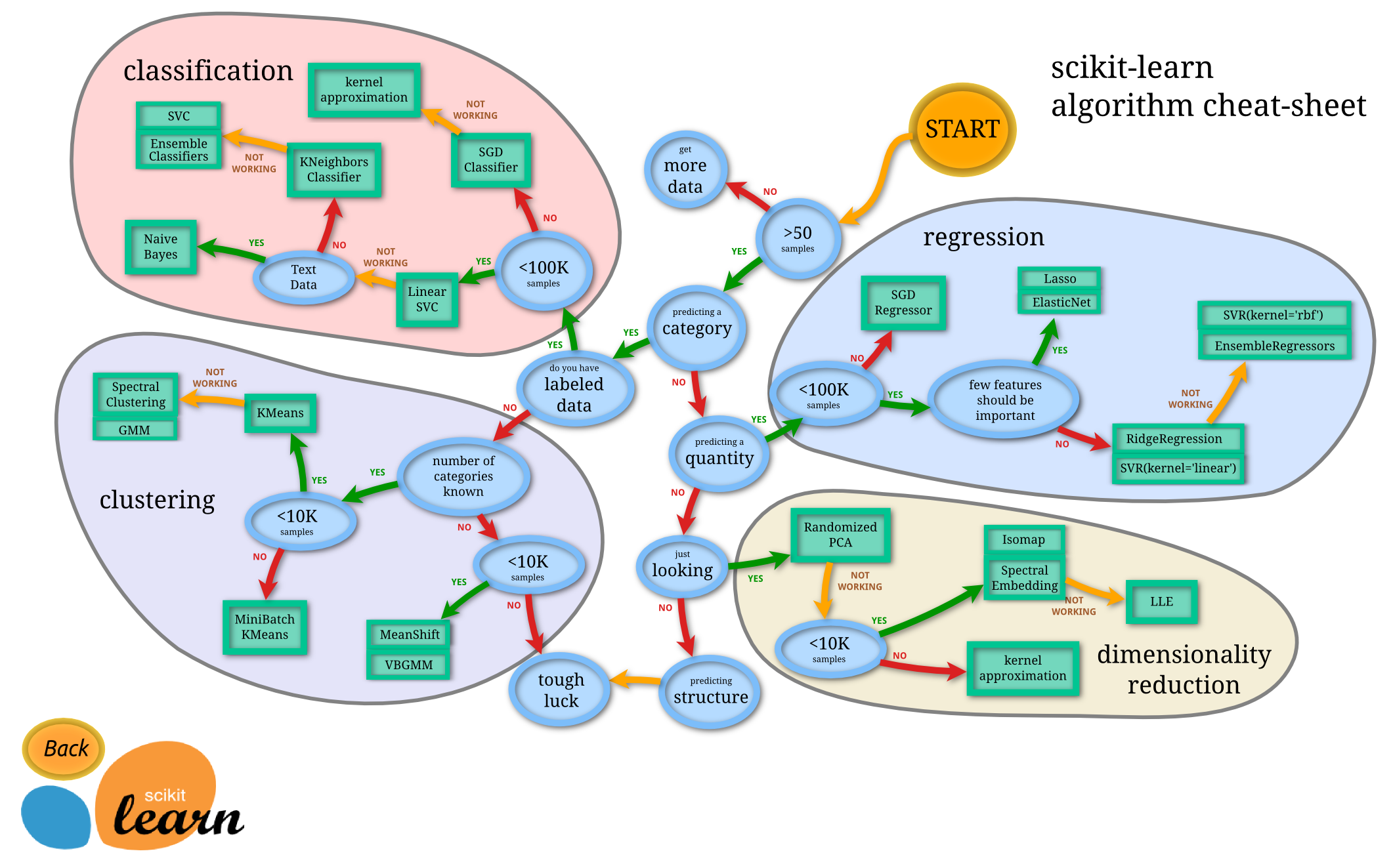
Figure: Helpful map of ML by scitkit-learn (Source)
\(\bowtie\)
We consider an application of dimensionality reduction in biology. We will look at single-nucleotide polymorphism (SNP)\(\idx{single-nucleotide polymorphism}\xdi\) data from viruses. A little background first. From Wikipedia:
A single-nucleotide polymorphism (SNP) is a substitution of a single nucleotide that occurs at a specific position in the genome, where each variation is present at a level of more than 1% in the population. For example, at a specific base position in the human genome, the C nucleotide may appear in most individuals, but in a minority of individuals, the position is occupied by an A. This means that there is a SNP at this specific position, and the two possible nucleotide variations – C or A – are said to be the alleles for this specific position.
Quoting Jombart et al., BMC Genetics (2010), we analyze:
the population structure of seasonal influenza A/H3N2 viruses using hemagglutinin (HA) sequences. Changes in the HA gene are largely responsible for immune escape of the virus (antigenic shift), and allow seasonal influenza to persist by mounting yearly epidemics peaking in winter. These genetic changes also force influenza vaccines to be updated on a yearly basis. […] Assessing the genetic evolution of a pathogen through successive epidemics is of considerable epidemiological interest. In the case of seasonal influenza, we would like to ascertain how genetic changes accumulate among strains from one winter epidemic to the next.
Some details about the Jombart et al. dataset:
For this purpose, we retrieved all sequences of H3N2 hemagglutinin (HA) collected between 2001 and 2007 available from Genbank. Only sequences for which a location (country) and a date (year and month) were available were retained, which allowed us to classify strains into yearly winter epidemics.
We load a dataset, which contains a subset of strains from the dataset mentioned above.
data = pd.read_csv('h3n2-snp.csv')
This is a large dataset. Here are the first five rows and first 10 colums.
print(data.iloc[:5, :10])
     strain  s6a  s6c  s6g  s17a  s17g  s17t  s39a  s39c  s39g
0  AB434107  1.0  0.0  0.0   1.0   0.0   0.0   0.0   0.0   1.0
1  AB434108  1.0  0.0  0.0   1.0   0.0   0.0   0.0   0.0   1.0
2  CY000113  1.0  0.0  0.0   1.0   0.0   0.0   0.0   0.0   1.0
3  CY000209  1.0  0.0  0.0   1.0   0.0   0.0   0.0   0.0   1.0
4  CY000217  1.0  0.0  0.0   1.0   0.0   0.0   0.0   0.0   1.0
For positions 6, 17, 39, etc., the corresponding columns indicate which nucleotide (a, c, g, t) is present in the strain with a 1.0. For example, strain AB434107 has an a at position 6 and 17, and a g at position 39.
Overall it contains \(1642\) strains (whose names are listed in the first colum). The data lives in a \(317\)-dimensional space (not counting the name of strain, i.e., the first column).
data.shape
(1642, 318)
Obviously, vizualizing this data is not straighforward. How can we make sense of it? More specifically, how can we explore any underlying structure it might have. Quoting Wikipedia:
In statistics, exploratory data analysis (EDA) is an approach of analyzing data sets to summarize their main characteristics, often using statistical graphics and other data visualization methods. […] Exploratory data analysis has been promoted by John Tukey since 1970 to encourage statisticians to explore the data, and possibly formulate hypotheses that could lead to new data collection and experiments.
In this chapter we will encounter an important mathematical technique for dimension reduction, which allow us to explore this data – and find interesting structure – in \(2\) (rather than \(317\)!) dimensions.